G&R Solutions Group
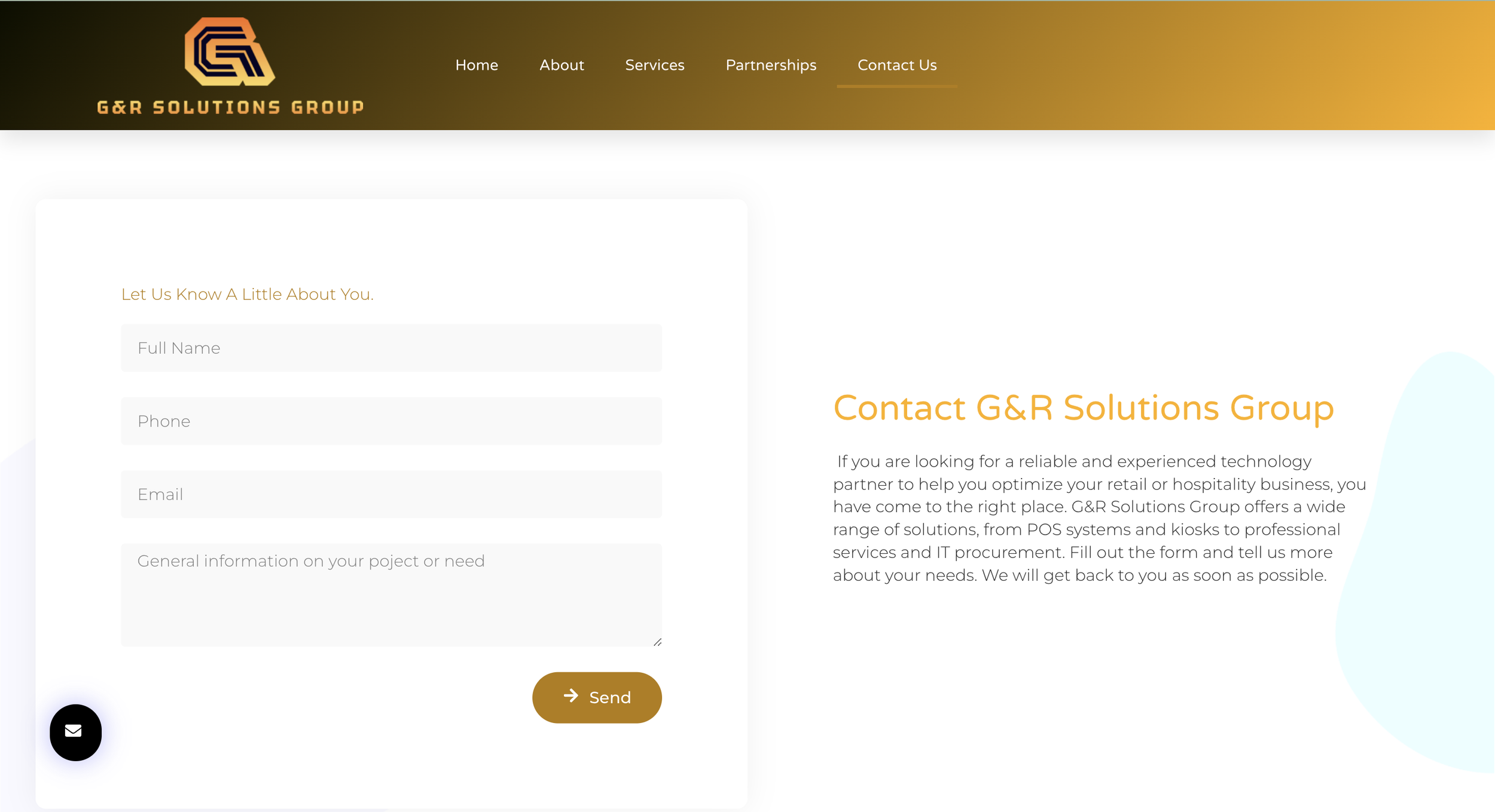
G&R Solutions helps businesses modernize through custom-designed kiosks and digital signage, but their online presence wasn't matching their reputation. Loyal customers were patient, but new visitors quickly lost interest due to confusion and frustration. A staggering 73% of users dropped off from the "Contact Us" form.
Role
User research, sitemapping strategy, wireframes
Team
1 Project Manager, 1 UX Designer (me), 1 Developer
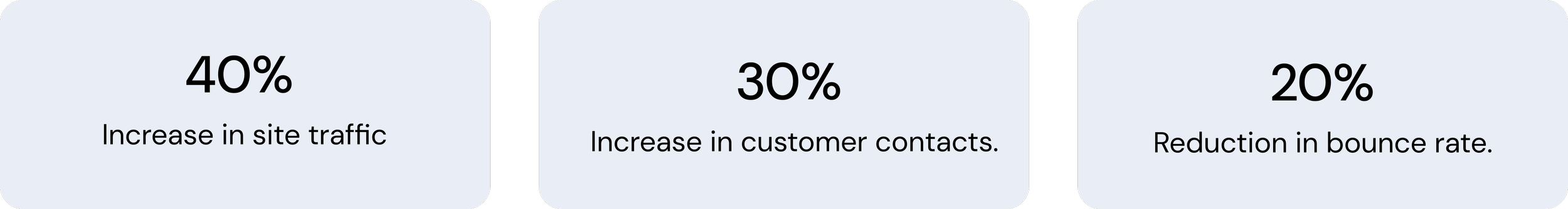
Impact
Problem
People weren't contacting us—and it was clear why.
The landing page was overloaded with information and unclear calls to action. Users were overwhelmed, unsure how to take the next step—leading directly to fewer inquiries.
Introduction
The main issue users were facing with the existing website was the lack of clear information about who we are and what we offer. The site was a basic landing page, making it difficult for potential clients to understand our value proposition and for customers to easily contact us.
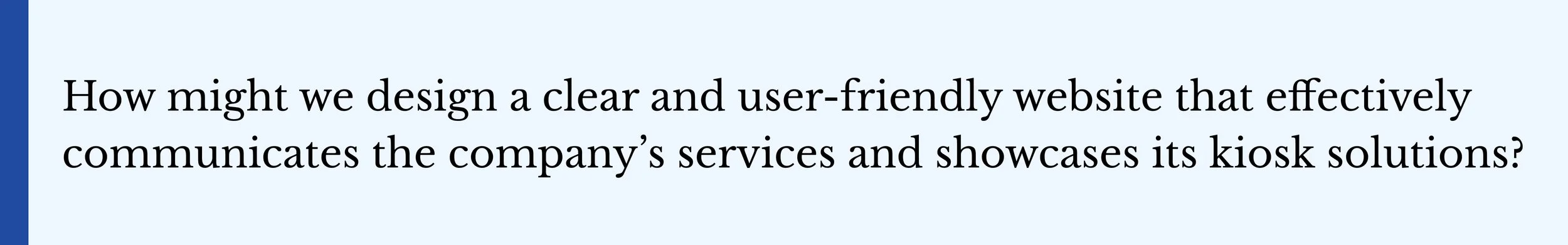
The challenge was to create a website that provides clear and concise content without overwhelming users, allowing them to easily navigate and engage with our products and services.
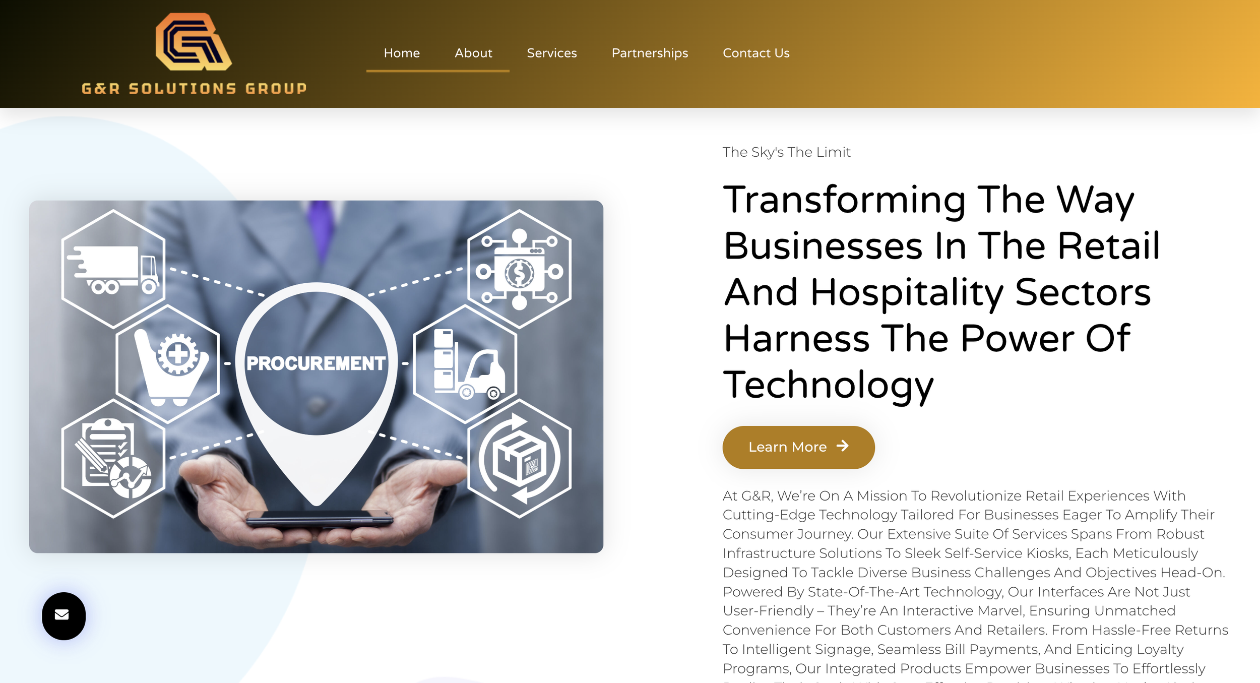
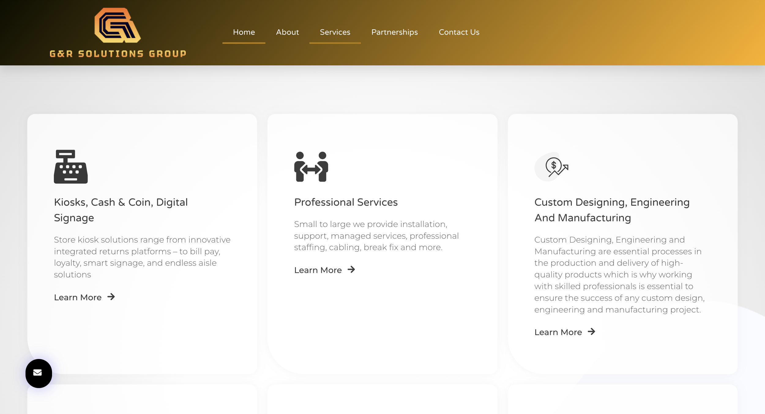
Original Website

Our Goal
How did we get there?
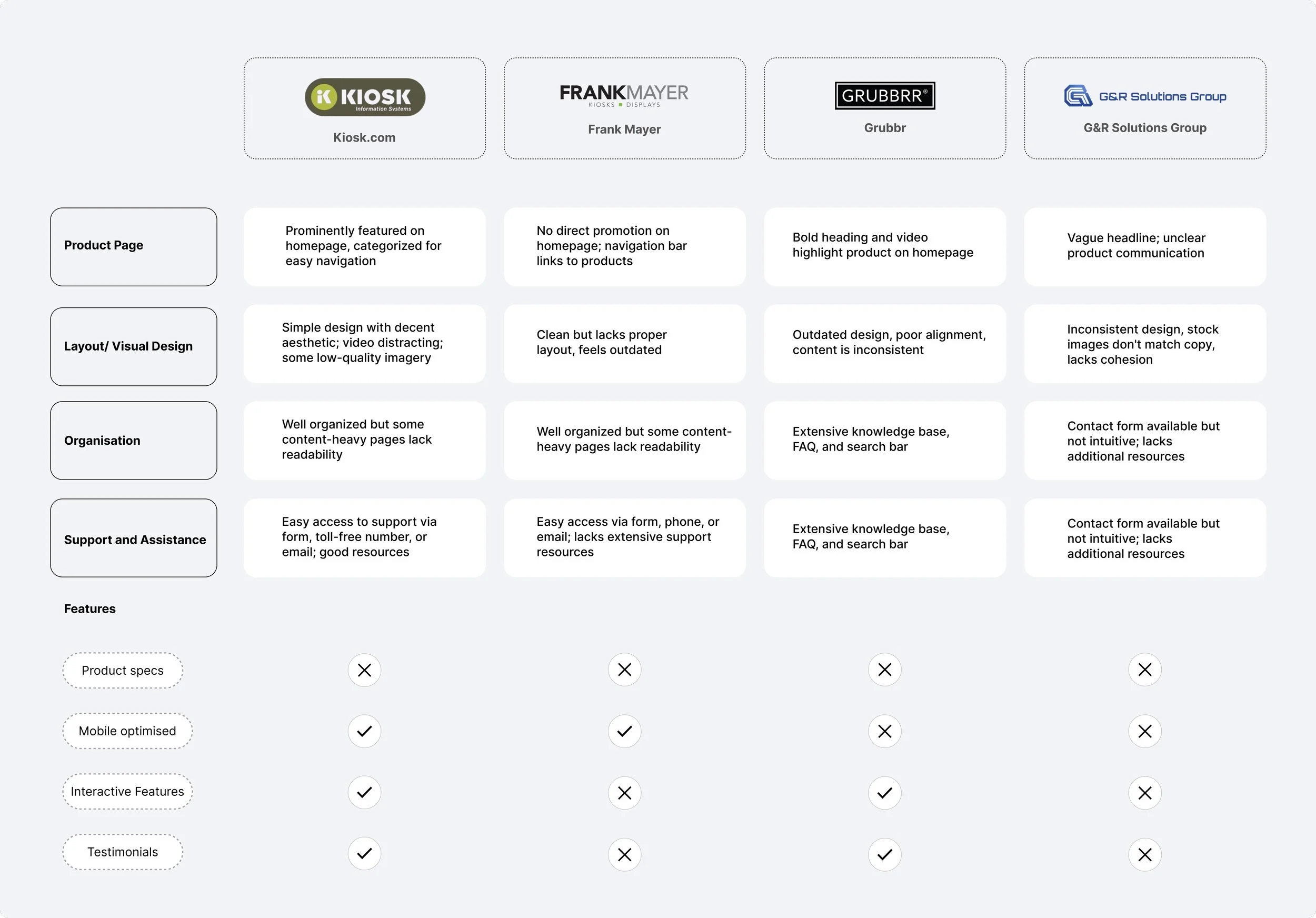
1.Competitive Analysis
Competitor websites, like Kiosk.com and Grubbrr, immediately communicated their offerings clearly and built trust with cohesive visuals. Their support sections were helpful and easy to use. Meanwhile, our site lacked product specifications, testimonials, and interactive elements—key factors that help customers confidently choose their products.
2.Stakeholder goals
We collaborated with the CEO and CFO of G&R Solutions to gain a clear understanding of their priorities and determine the key pages required to align the website with their strategic business objectives.
Kiosk product page
Landing page

Kiosk specs

3. User Research
We interviewed 5 members to identify specific problems when navigating and performing tasks such as finding product details, accessing resources, and scheduling a meeting.

4.Heuristic evaluation
Defining the problem

What’s Next?
We used the research and a variety of exercises to further understand user needs, behaviors, and pain points, forming a strong foundation for the platform.
Site Map


WIREFRAMING
After defining the problem and redesign goals I worked on lofi wireframes.
It was important to have clear CTA and clear navigation to improve efficiency and reduce confusion for users

After completing the testing phase, we proceeded to the design stage.
Visual Design
Navigation
Made the navigation simple and straightforward to help users quickly find what they need without confusion.

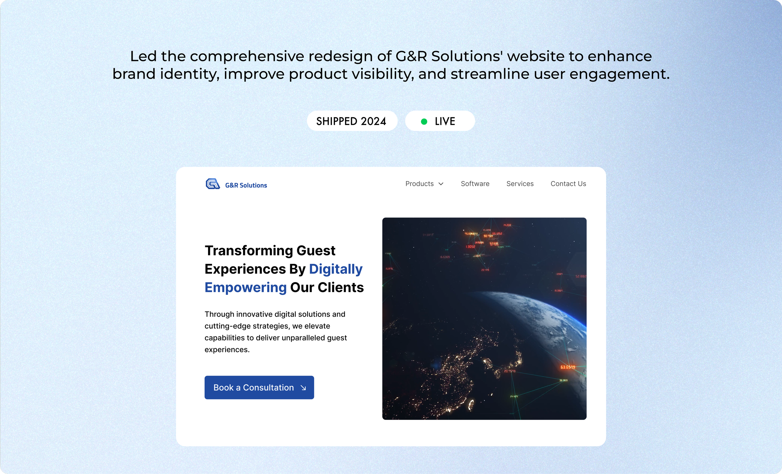
Final Concept
Displaying our products and their specs was my top priority, so I focused on creating a clear, organized layout that made information easy to find and understand.
Final Overview
The G&R Solutions Group website redesign simplified navigation, improved product visibility, and modernized the visual design. By introducing prominent CTAs and updating the style guide, we streamlined the user experience and boosted SEO, leading to a 40% increase in site traffic.
My Learnings
Working fast, lean, and scrappy taught me invaluable lessons.
